

Numbers are not boring … Bored are the people who do not know how to use them to tell a story.
Yes, we like numbers … as long as they are used in a story with meaning and relevance to the audience.
What is the secret to narrate with data? What is the magic behind storytelling? In this article, I share the guidelines I have learned and put into practice in five years of telling journalistic stories with analysis and visualization of data.
Rule of thumb:
Numbers tell what happens as stories build connections and context to make events understandable and memorable.
To tell a story with data, we must find the anecdote, the perfect event, hook the reader to the data that sustain a research, an article, a visual history.
Let’s start: What is narrative with data?
It’s using numbers to tell a revealing and engaging story
On what is it based?
- On precise data
- Graphic / visual representation
- Narrative: to tell the story.
Narrative with data: the art of presenting data to raise the understanding of a topic. Let the light be made.
For light to be made and not to perish in a dark cave full of fire and dragons, you need:
- Accurate data (precious, as I like to call them, too)
What are they?
- Data based on an honest research / collection / methodology – NO ALTERNATIVE FACTS or adjusted to convenience.
- Data with credibility: free of human errors (with or without intention). Typing errors, blank spaces, missing values, zeroes replacing missing values.
- Verifiable: with sources that validate if they are close to reality or can be contrasted with others.
- Structured: can be processed by a computer
- Meticulously analyzed. NEVER torture your data to say what you want instead of what they say.
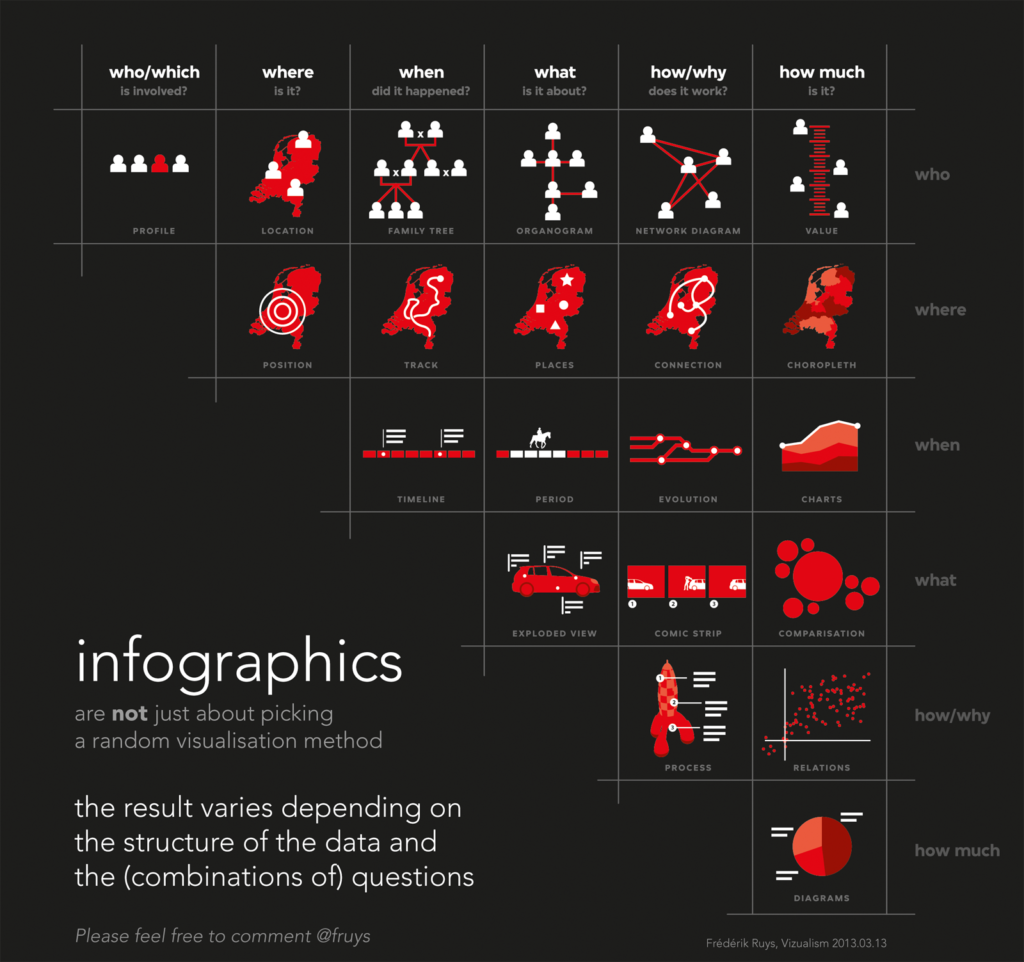
Graphic / visual representation
- It consists in analyzing and answering. What is the best way to present the information?
- What kind of graphics will you use and why?
- How will you use photos and videos or other visual elements to get your reader’s attention to your message?
Below is an infographic that will help you make those decisions.
Finally, the narrative consists in:
Telling the story
How?
- Explain things in a simple way, but do not disregard their depth. Never underestimate the intelligence of your reader.
- Avoid palaver that does not mean anything. In this category also falls the abuse of technical language, which denotes that you did not understand anything about the subject or were lazy enough to think and bring it closer to your audience.
- Edit, edit and edit.
- Respect the rules of writing and spelling
- Give clear instructions on how to use the graphics and what they are for.
- Apply the structure, introduction, development, and conclusion.
- Keep the interest of your audience by explaining how the problem you stated at the beginning was solved, step by step.
How to put all those guidelines in action? You can explore one of the projects where we practiced most of these tips.
STOLEN MEMORY: the hidden stories of the prehispanic heritage looting of Costa Rica
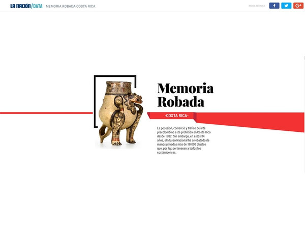
About this project, the Society of News Design (SND), which awarded us a silver medal in its world news design contest, in 2017, said:
«The work is done with an exquisite taste and it is also an interesting subject. The fact that they decided to tell most of the research through graphics is very well executed. It is worth highlighting the audacity to tell a story of this kind in this way. Graphics are very well edited and only show what is necessary. This piece is more chiseled than others and that simplicity makes it stand out,» says the jury’s comment.
If you wish to reproduce this article or refer to it, please include the original link in your publication.